I loghi tipografici o loghi wordmarks sono quei loghi creati interamente con l’uso della tipografia. Un luogo comune è che essi si possano fare in poco tempo e che la loro progettazione non richieda alcuna abilità. Niente di più sbagliato!! Concettualmente, sono fra i più difficili da creare! L’utilizzo di loghi tipografici sta diventando un concetto molto popolare, perché offrono ai designers la flessibilità necessaria per essere creativi senza sovracompensare la grafica ed ostentare colori forti. I disegni tipografici sono, generalmente, manipolazioni creative ed interessanti di lettere e numeri in diversi tipi di carattere. Alcuni di loro sono divertenti, altri sono più concettuali, mentre altri ancora sono di pura inventiva del designer. Indipendentemente dall’approccio utilizzato dal designer, i loghi tipografici creano un design pulito e compatto, che va benissimo per tutti i tipi di business ed è facilmente trasferibile a tutti i tipi di carta e supporti web.
Qui di seguito, troverete dodici dei loghi tipografici più creativi che sono utilizzati da aziende di diversi settori:
Bee
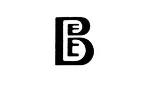
In questo logo, il designer ha scelto di mostrare il suo lato creativo: la parola “Bee” viene raffigurata con l’aggiunta di due “E” all’interno di una grande B.
BISON
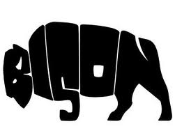
Questo è uno dei miei preferiti, in quanto la parola “BISON” (bisonte) viene modificata in modo tale da visualizzare la sagoma dell’animale! Penso che questo sia uno dei loghi tipografici più creativi che abbia mai visto. Personalmente, mi piacciono quei loghi che non hanno bisogno di scrivere il proprio nome sotto il logo perché è già chiaramente visibile all’interno dell’immagine.
Coffee
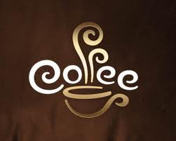
Questo logo tipografico è uno dei loghi più efficaci che abbia mai visto! Sembra quasi che ci faccia vedere e sentire l’odore del caffè attraverso l’uso di due “f” per simulare il vapore!
DarkBird Studios
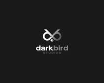
Il logo “darkbird” visualizza una zona di luce ed un contrasto scuro con la rappresentazione creativa delle lettere “d” e “b”, che appaiono come se fossero gli occhi di un uccello!
DAVID
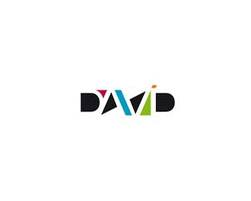
Questo è un tipico caso di quando la tipografia incontra l’arte astratta. Mi piace come la “A” e la “V” di David condividono una “parete” comune.
Flat Land
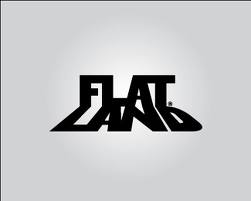
Il logo “FLAT LAND” avrebbe potuto essere un design semplice ed anonimo, ma è l’uso creativo della parola “LAND” come ombra che fa la differenza! Questo concetto è stato così ben fatto che probabilmente nessuno di noi si fermerà a considerare che la parola “FLAT” non avrebbe mai potuto creare un’ombra….”LAND”. La luce sullo sfondo porta anche a pensare lo spettatore ad un concetto di ombra e questo fa pensare che il logo sia stato creato da qualcuno che ha buona conoscenza dei concetti grafici.
HALF
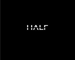
Questo è un concetto molto semplice ed interessante: la parola “HALF” (in italiano metà) viene composta da lettere…..tagliate a metà!
killed productions
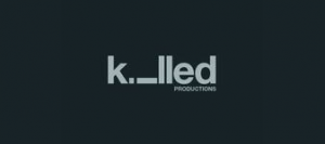
Questo è un logo molto semplice ma artistico. Il design ruota intorno alla parola “killed” (ucciso) e raffigura una lettera “i” stesa come se fosse stata appunto…..uccisa!
Mouse Universe
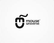
La prima cosa che ho notato quando ho guardato questo logo tipografico è stato il mouse del computer. Solo alla seconda occhiata ho capito che il mouse è stato composto dalle lettere “M” ed “U” di Mouse Universe! Decisamente un logo molto originale e creativo.
Seo Solution
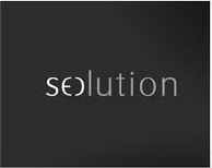
Coloro che non hanno familiarità con la parola SEO, potrebbe non aver capito immediatamente la creatività di questo logo. Ma, per quelli di noi che hanno familiarità con il termine, possiamo notare come la parola SEO, all’inizio della parola, forma anche la “S” e la “O” per formare anche la parola “Solution”. Una…soluzione davvero originale!
come dovrebbero essere i loghi, puliti secchi ed iconici, peccato che poi il cliente non sempre è d’accordo ed impacchiana tutto